
A self-initiated redesign of ARCA homepage — focused on structure, readability, and mobile responsiveness
It is Argentina’s national platform for tax and customs procedures. It offers users access to fiscal services, documentation, and updates—mostly through its online portal, managed by AFIP. Despite its critical role, the platform often overwhelms users with dense content, inconsistent visuals, and a complex navigation experience.
2025


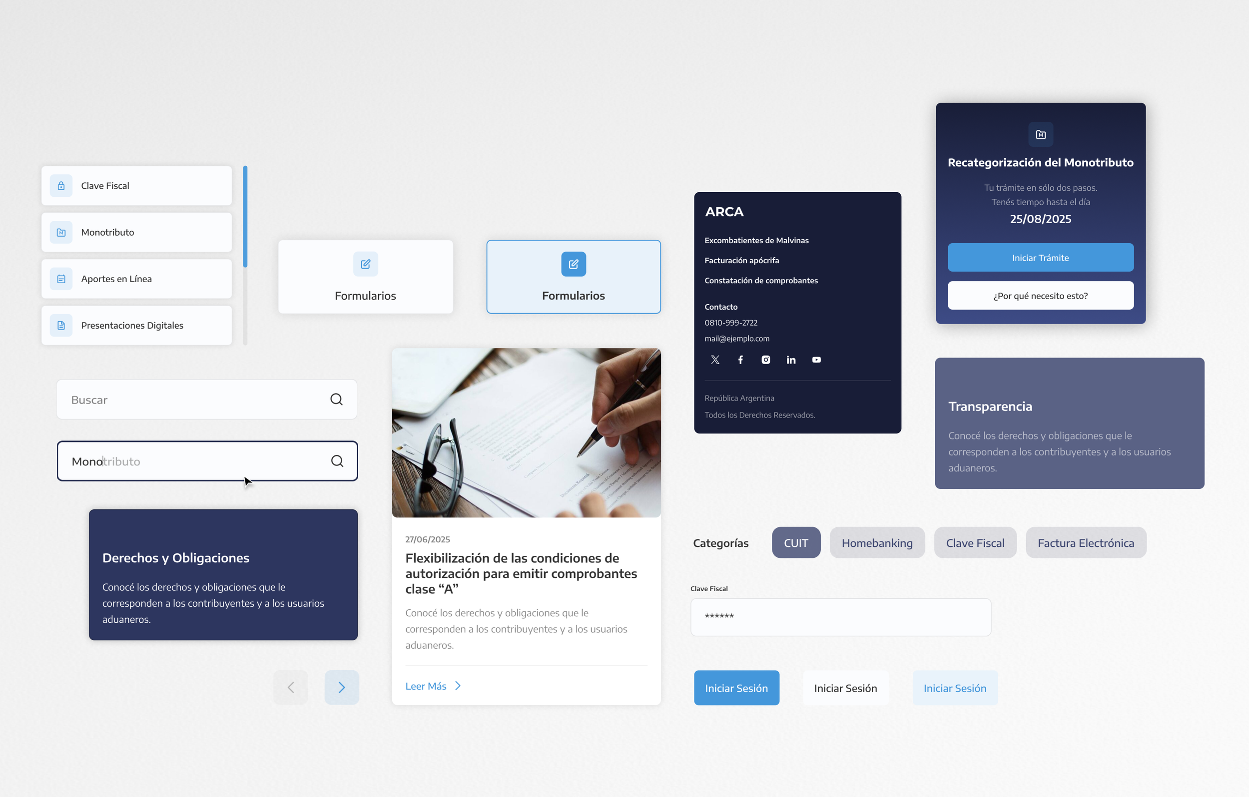
Challenge
The existing AFIP homepage, while functional, suffers from cluttered layout, inconsistent font styles, lack of visual hierarchy, and a dated UI system. Information is hard to scan, especially for users unfamiliar with tax vocabulary. CTAs are not clearly prioritized, and responsiveness across devices lacks refinement.
Common Pains
Accessibility
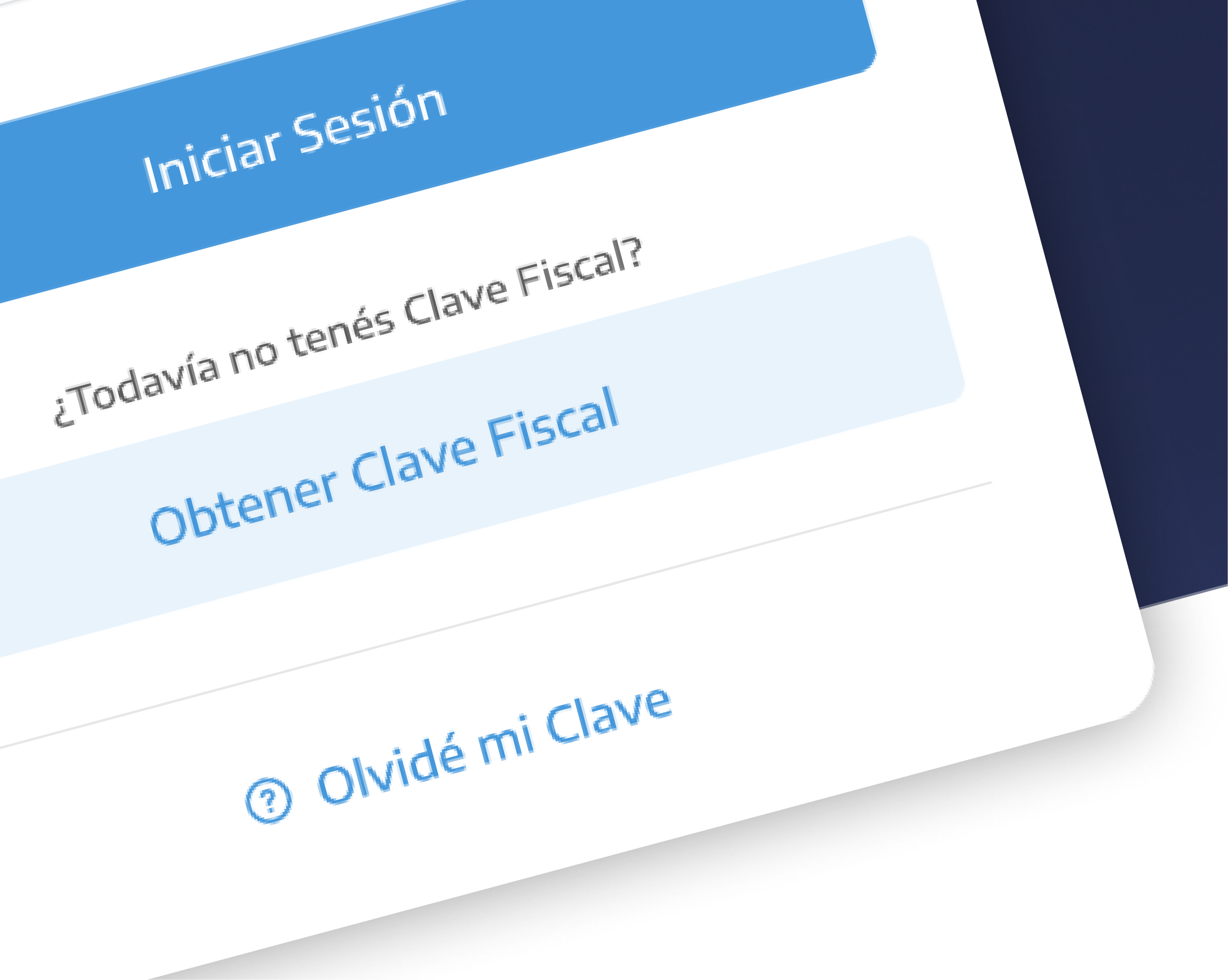
Difficulties locating specific actions (like “Recategorizar Monotributo” or “Ver novedades”) - unclear distinction between primary, secondary, and supportive ones.
Visual Inconsistency
The interface lacked typographic hierarchy, grid consistency, and standardized spacing, resulting in inefficient layout and poor mobile responsiveness.
Solution


Pixel perfect.
20px — 32px — 42px — 60px — 100px
Margins & Paddings
8px — 20px
Corner Radios
Before & After


Project Details
ProductWeb Design
Duration3 days
RoleUX UI Designer
ToolsFigma
IndustryGovernment / Public Services / Civic Tech
What I didUI Enhancement
Visual Hierarchy + Typography Refinement
Responsive layout
Design System
Accessibility consirations
This is a conceptual project created as a design exercise.
UX UI LEAD & VISUAL ARTIST
Let’s work together
I specialize in creating bold, thoughtful digital experiences.
Let’s connect and bring your next vision to life.